
As we welcome new shades to our Vision Colour Palette, our Showroom and Interior Designer, Jeanine Goddard, shares her thoughts on our new colours and the current fashion trends of 2021.
Colour is the first aspect of any object that the eye picks up.
At Bisley, we are conscious that colour is as important as any other attribute of a piece of furniture. Colour fashions change and always reflect the times, so we constantly monitor what is going on in the world of interiors, architecture, fashion and automotive. All of these fields are interrelated, but change at different speeds.
The need to offer colours which reflect the current fashion trends must also be balanced with the desire to establish a range of colours that not only transcend fashions, but consider the operational needs of any manufacturer.
Deleting colours that are no longer required by the market is therefore, perhaps surprisingly, always our starting point. It’s all in the numbers! We reviewed which colours our customers were ordering, or rather not ordering anymore, and decided this year it was time to phase out three colours from our range: Alaska, Parma and Mimosa.
However, should there become a need to support an existing installation, for example, then of course we would be able to help.
Our latest colour introduction was Ocean Blue (RAL 5020) in 2018, so it is most certainly time to freshen up our range.
To decide which new colours would be introduced, we scoured trend forecasts on a global scale and looked for gaps in the Bisley Vision range.
One of the seemingly obvious contenders for this year would have been our answer to the Pantone colour of 2020, Classic Blue, but Bisley already covers the blue spectrum comprehensively with our Oxford Blue ay7 and Prussian bp7, to name just two of the blues closest to Classic Blue by Pantone.
On review, two colour groups were missing: a Green and a very light Pink.
The Green is very much related to the biggest trend in office interiors at this moment, wellness and Pink is a trend that started at the beginning of the last decade and continues to rise in popularity.
The last gap was a warm, deep Yellow - the perfect shade combination to complete our palette!
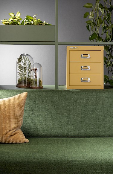
Olive Green, (RAL 6003), bx6:
A soothing, grounding, dark shade of Green that complements the emerging trend for light wood finishes. It also acts as a background colour to the varying greens of the ever-present houseplants trend. However, this shade also complements the re-emergence of Seventies Rusts, Dijons and dark Yellows.
Paired with Beige or Muted Terracotta walls, Gold or oak wood finishes and Bisley’s Golden Sunflower Yellow cd1 or even our Palest Pink cb2, makes the perfect combination.
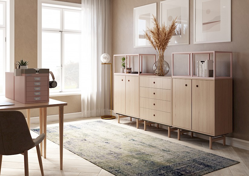
Palest Pink, cb2:
A pale, but warm salmon shade, Palest Pink has been increasingly used in interiors as a soothing neutral and as well as a backdrop to Muted Terracotta. Having shed its association with girly bedrooms, Palest Pink be funky combined with Orange and Yellow shades. Alternatively mix with light walls and plenty of light-coloured woods, like maple or birch plywood, for a fresh atmosphere.
Create a grown-up feel by combining our Palest Pink with Black metal and warm shades of Grey, like Bisley’s very light Portland ab8, the warm Slate an9 or even our new Olive Green, bv6.
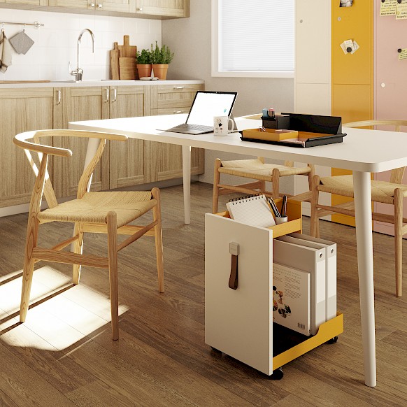
Golden Sunflower Yellow, cd1 (RAL 1004):
A classic, deep, feel good shade of Yellow that will endure the test of time and changing fashions.
Yellow is the classic colour for wayfinding. It stands for confidence, optimism, creativity, imagination and cheerfulness. Though it works well in kitchens, it needs to be used sparingly, ideally as an accent colour. Golden Sunflower Yellow combines well with dark woods like Walnut, Bisley’s Coffee av5, Sepia br8 and our new Olive Green bx6, for a warm 70’s feel. Alternatively use with neutrals or as an accent colour in front of a dark teal backdrop or dark blue walls.
Steel Silver:
Also new to the Bisley vision colour palette, replacing our Clear Lacquer shade to give you a more defined tone is Steel Silver. Sitting tonally within the colour palette, Steel Silver can be paired with a range of colour combinations. Complementing any environment Steel Silver sit perfect in the home office or through to the living room. The shade is a beautiful combination of Silver and Slate, bringing you the best of both.
PS: It is important to note that the representation of colour on a screen or in print may not be completely true to the shade shown. Only physical samples or a RAL card, where a reference is stated, can give you an accurate idea.
The best way to view these new colours is to see them in situ at our Dallington Street showroom, which you can visit by appointment only. Do get in touch on +44 (0)203 952 4000.